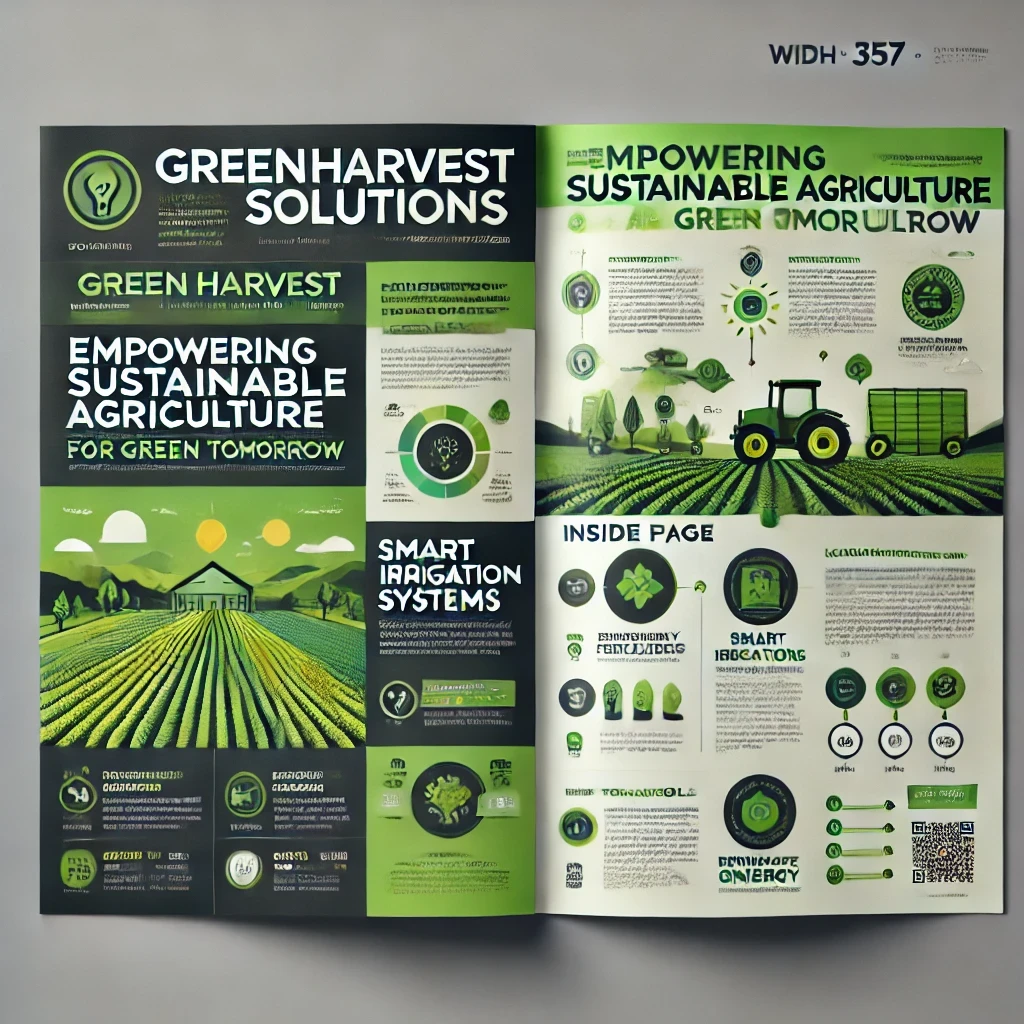
Brochure

UI/UX Case Study: Designing a Marketing Brochure for GreenHarvest Solutions
Introduction
GreenHarvest Solutions, a sustainable agriculture company, required a marketing brochure to showcase its innovative solutions for eco-friendly farming. The goal was to design a brochure that would capture attention, communicate value, and drive interest among farmers, investors, and partners.
This case study explores the UI/UX process of designing the brochure, focusing on visual hierarchy, content organization, and interactivity for print and digital formats.
Objectives
Communicate the Brand’s Vision: Highlight GreenHarvest’s commitment to sustainability and innovation.
Simplify Complex Information: Present technical solutions in an easy-to-understand manner.
Engage the Audience: Create a visually appealing design to maintain user interest.
Optimize for Multi-Format Use: Ensure adaptability for print and digital (PDF or interactive formats).
Target Audience
Farmers: Individuals interested in adopting sustainable practices.
Investors: Stakeholders looking to understand the company’s market potential.
Partners: Businesses seeking collaboration opportunities in eco-friendly initiatives.
Research and Insights
User Research
Preferences for Brochures:
Clear, concise content.
Large visuals with minimal text.
Infographics to simplify data-heavy information.
Pain Points:
Overwhelming text blocks often lead to disengagement.
Poor structure in brochures makes it hard to find relevant details quickly.
Competitor Analysis
Analyzed brochures from competitors in the sustainability industry.
Key Takeaways:
Effective use of whitespace improves readability.
Personal stories and testimonials build trust.
Consistent branding enhances recognition.
Design Process
1. Content Structure
A content outline was created to ensure logical flow:
Cover Page: Eye-catching design with the company’s logo, tagline, and main benefit statement.
About Us: Brief introduction to GreenHarvest’s mission and values.
Core Offerings: Detailed sections on sustainable farming solutions with visual aids.
Success Stories: Case studies with testimonials and before-and-after metrics.
Call to Action: Contact information and QR code linking to the website.
2. Visual Hierarchy
Prioritized key information by:
Using bold headers and subheaders for scannability.
Highlighting important stats and benefits with icons and large fonts.
Structuring the page layout into digestible sections with clear headings.
3. Color Palette
Primary Colors:
Green (#4CAF50): Symbolizes sustainability and growth.
White (#FFFFFF): For a clean, breathable design.
Accent Colors:
Yellow (#FFEB3B): Adds a pop of energy to draw attention.
Dark Gray (#333333): Ensures text readability.
4. Typography
Headings: Montserrat Bold – modern and impactful.
Body Text: Roboto Regular – clean and professional.
Highlighted Stats: Montserrat Medium – ensures emphasis.
5. Interactive Elements
For the digital version:
Clickable Buttons: Added “Learn More” buttons to sections, linking to specific pages on the website.
Embedded Videos: Used video links to explain complex solutions visually.
QR Codes: Integrated QR codes for quick access to detailed reports and contact forms.
Key Design Features
Cover Page
A hero image showcasing a lush, sustainable farm.
Tagline: “Empowering Sustainable Agriculture for a Greener Tomorrow.”
GreenHarvest’s logo prominently displayed.
Core Offerings Section
Divided into three key areas: Eco-Friendly Fertilizers, Smart Irrigation Systems, Renewable Energy Solutions.
Infographics explaining the impact of each solution (e.g., “Reduces water usage by 40%”).
Icons for quick recognition.
Success Stories
Included testimonials from farmers and partners.
Before-and-after visuals (e.g., land transformation).
Highlighted measurable benefits like “20% increase in crop yield.”
Call to Action
Clear contact details with social media icons.
QR code linking to a consultation booking page.
Button text for the digital version: “Schedule a Free Demo.”
Challenges and Solutions
Challenge: Avoiding information overload while addressing different audience needs.
Solution: Used collapsible sections in the digital version and concise copy in print.
Challenge: Maintaining a consistent look across print and digital formats.
Solution: Designed in Adobe InDesign with export-friendly layouts for both mediums.
Challenge: Making technical solutions engaging.
Solution: Used illustrations and infographics to visualize technical concepts.
User Feedback
Farmers: Praised the readability and visual aids simplifying technical solutions.
Investors: Appreciated the case studies with quantifiable metrics.
Partners: Found the digital interactive version convenient for quick navigation.
Outcomes
Increased Engagement:
30% higher inquiries during the first month after the brochure launch.
Improved time spent on the digital brochure (average session duration: 3 minutes).
Stronger Brand Identity:
Consistent branding across materials boosted GreenHarvest’s credibility.
Positive User Sentiment:
90% of surveyed users found the brochure design “engaging and informative.”
Future Enhancements
Localized Versions: Create translations for regional audiences.
Enhanced Interactivity: Add animations to the digital format for better storytelling.
Regular Updates: Refresh content every quarter with new case studies and data.
Conclusion
The GreenHarvest marketing brochure successfully combined visual appeal with functional design, addressing diverse audience needs. By integrating UX principles, the brochure not only communicated the brand’s value but also engaged users effectively, driving conversions and strengthening GreenHarvest’s market presence.
Let me know if you'd like this tailored further or visual design examples included!