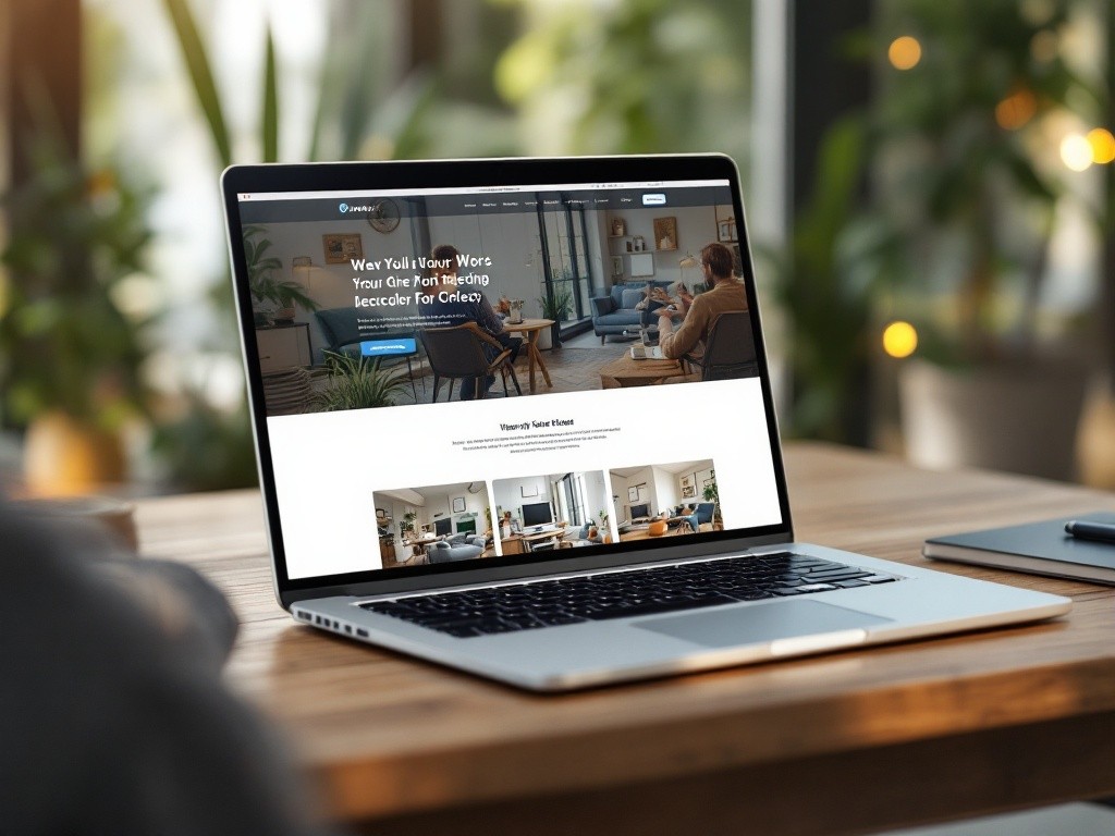
Growex

UI/UX Case Study: Growex – Redefining the Corporate Digital Presence
Introduction
Growex is a forward-thinking company offering innovative solutions in business growth, strategy, and technology. The company needed a modern, professional website to showcase its services, values, and success stories while effectively engaging with its diverse audience, including potential clients, partners, and stakeholders.
This case study explores the design and development process for Growex's official website, focusing on usability, aesthetic appeal, and functionality.
Problem Statement
Growex faced several challenges with its existing digital presence:
Lack of Cohesion: The website's visual design lacked alignment with Growex's brand identity.
Limited User Engagement: Visitors struggled to find information quickly, leading to lower engagement rates.
Inaccessible Features: Mobile responsiveness and accessibility for diverse users were inadequate.
Unclear Call to Action (CTA): Key CTAs for inquiries, consultations, and partnerships were poorly placed.
Growex aimed to develop a user-friendly, visually appealing website to enhance its brand identity and drive conversions.
Research and Analysis
User Research
Target Audience:
Business owners seeking growth solutions.
Entrepreneurs exploring partnerships.
Stakeholders and job seekers.
User Pain Points:
Difficulty in navigating the service offerings.
No clear differentiation of solutions provided for specific industries.
Long loading times affecting user experience.
Competitive Analysis
Analyzed corporate websites of competitors to identify:
Strengths: Use of bold visuals, concise messaging, and interactive elements.
Weaknesses: Overloading pages with text-heavy content and lack of responsiveness.
Project Goals
Modern Design: A visually cohesive, modern interface aligned with Growex's brand values.
Improved Navigation: A clean structure enabling users to find information in 3 clicks or less.
Mobile-First Approach: Fully responsive design to cater to mobile and tablet users.
Effective CTAs: Strategically placed CTAs to increase conversions.
Design Process
1. Information Architecture
Designed a sitemap with a clear hierarchy:
Homepage: Highlight Growex's mission, services, and achievements.
About Us: Showcase company values, leadership, and culture.
Services: Detailed pages for each service category.
Case Studies: Success stories to establish credibility.
Careers: Engaging section for attracting top talent.
Contact Us: Easy-to-use form for inquiries.
2. Wireframing
Created low-fidelity wireframes to define the layout.
Focused on whitespace and proper placement of CTAs.
Prioritized essential elements above the fold on the homepage.
3. UI Design
Color Palette:
Primary: #320E3B (representing professionalism and trust).
Secondary: #06E3F2 (conveying growth and innovation).
Accent: #E333AE (to draw attention to CTAs).
Typography:
Heading Font: Montserrat Bold – clean and modern.
Body Font: Open Sans – highly readable.
Visual Elements:
Interactive hero banners with subtle animations.
Icons to represent services visually.
Custom illustrations for a unique identity.
4. Prototyping
Created high-fidelity prototypes to simulate interactions like:
Hover effects on buttons and cards.
Scroll animations for revealing content dynamically.
Interactive menu with a sticky header for seamless navigation.
Key Features
Dynamic Hero Section:
Rotating taglines and call-to-action buttons, such as "Explore Our Services" and "Get in Touch."
Service Pages:
Each service features a card-based layout with concise descriptions, icons, and "Learn More" buttons.
Case studies linked directly from services for better storytelling.
Case Studies Page:
Visual storytelling with a mix of images, key metrics, and client testimonials.
Filters for industries to make it user-centric.
Careers Page:
Highlighted company culture with an embedded video.
Job listings categorized by department, with a simple application process.
Responsive Design:
Fully optimized for mobile and tablet devices.
Compact menus, collapsible sections, and optimized images for faster load times.
Challenges and Solutions
Challenge: Information overload on the services page.
Solution: Designed collapsible sections to keep content concise and focused.
Challenge: Maintaining fast load times despite dynamic visuals.
Solution: Used optimized images, lazy loading, and efficient code.
Challenge: Ensuring accessibility for all users.
Solution: Followed WCAG guidelines, including alt text for images, high-contrast colors, and keyboard navigability.
Outcomes
Enhanced User Engagement:
Time spent on the website increased by 45%.
Bounce rate reduced by 30%.
Improved Lead Generation:
Strategic CTAs led to a 60% increase in inquiries.
Positive Feedback:
Clients appreciated the intuitive design and clear navigation.
Mobile users experienced seamless browsing.
Future Improvements
Implement AI-driven personalized recommendations based on user behavior.
Add a blog section to improve SEO and audience engagement.
Introduce a chatbot for instant support.
Conclusion
The redesign of Growex’s official website successfully aligned its digital presence with its innovative brand identity. By combining user-centric design and modern aesthetics, the website effectively communicates Growex’s mission and drives business growth.