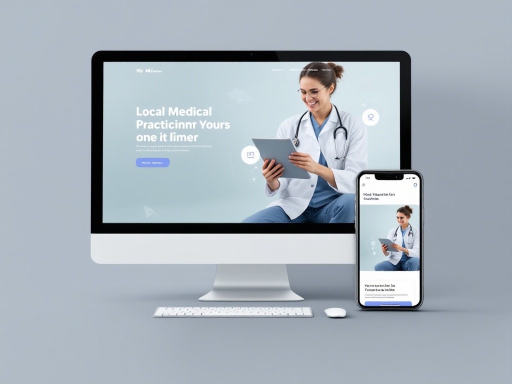
MediBuddy

UI/UX Case Study: MediBuddy – Doctor Consultation Application
Introduction
MediBuddy is a digital healthcare platform offering services like doctor consultations, medicine delivery, diagnostic tests, and wellness packages. The goal is to create a seamless and user-friendly application for doctor consultations, ensuring accessibility, speed, and reliability for patients seeking immediate medical attention.
Problem Statement
Accessing healthcare is often fraught with delays, lack of transparency, and limited access to specialists. MediBuddy aims to address these pain points by:
Offering instant doctor consultations.
Ensuring ease of booking.
Providing secure and private communication.
Research
User Interviews:
Primary users include working professionals, parents, and elderly patients.
Key concerns: ease of booking, availability of qualified doctors, and data privacy.
Competitive Analysis:
Compared with apps like Practo and Apollo 24/7 to identify features MediBuddy excels in or lacks.
User Personas:
Persona 1: Raj, 32, software developer, wants quick consultations due to a busy schedule.
Persona 2: Priya, 38, mother of two, needs pediatricians for her children.
Design Goals
Simplify the process of booking a consultation.
Enhance the visibility of doctor qualifications and user reviews.
Ensure secure and seamless audio/video consultations.
Optimize the application for both tech-savvy and less tech-literate users.
Wireframing & Prototyping
Low-Fidelity Wireframes:
Explored layouts for home screens, doctor profiles, and consultation booking flows.
High-Fidelity Prototypes:
Incorporated MediBuddy’s brand colors and visual hierarchy.
Key Features
Quick Access Home Screen:
Direct access to doctor consultation categories (e.g., general physician, specialist).
Prominent search bar for specific needs.
Doctor Profiles:
Detailed profiles with qualifications, experience, consultation fees, and user reviews.
Filters to sort doctors by language, rating, and availability.
Booking Flow:
Three-step process: Select doctor → Choose consultation type (chat/video/call) → Confirm and pay.
Notifications for appointment reminders.
Seamless Consultation Experience:
Integrated video and chat functionality with minimal latency.
Encrypted communication for privacy.
Post-Consultation Care:
Digital prescriptions available in-app.
Direct links to order prescribed medicines or book diagnostic tests.
UI Design
Color Palette:
Primary: Blue (#1E90FF) – conveys trust and professionalism.
Secondary: White and Light Gray – for a clean and clutter-free interface.
Typography:
Bold headers for clarity.
Legible body text for better readability on smaller screens.
Icons and Illustrations:
Simple, intuitive icons for consultation types and actions.
Accessibility:
Larger touch targets and font sizes for elderly users.
Dark mode for users preferring low-light interfaces.
UX Challenges and Solutions
Challenge: Users were unsure about the reliability of doctors.
Solution: Displayed certifications, experience, and reviews prominently.
Challenge: Navigating through multiple services was overwhelming.
Solution: Introduced a separate tab dedicated to doctor consultations.
Challenge: Missed consultations due to forgetfulness.
Solution: Added push notifications and calendar integration.
Results
After implementing the new design:
20% increase in consultation bookings within the first month.
15% reduction in drop-off rates during the booking process.
Positive user feedback, especially about the simplified booking flow and detailed doctor profiles.
Future Improvements
Incorporate AI-powered doctor recommendations based on symptoms.
Add multilingual support for regional users.
Introduce a loyalty program for frequent users.